This artifact was chosen because of the wide range of skills and abilities that it requires in software development. The artifact was written in Python, uses MongoDB for the database and Dash for the view. There is an inclusion of some HTML and CSS, in addition. Besides the use of CRUD (Create, Read, Update, Delete), MCV (Model, Controller, View), and Data Analysis Techniques, it also includes a ReadMe file that communicates the features of the project for use by other professionals. Communication is a key component to software development. Another reason that I chose this artifact is that I find dashboards insightful for changing dynamically with the filtering of the data. It allows the data to be visualized and shared in a meaningful way.
The artifact was improved with changes to the ReadMe file to communicate better. The FAB (floating action button) for debugging was removed for a production ready application, comments were updated, deprecated features were updated to enhance security and functionality, some changes to the code were made for clarity and readability, and a bar chart was added to show more insights into the data. The bar chart included data analysis techniques. I had to clean the data before using it to create the bar chart because the raw data had some empty strings. This cannot be eliminated with a simple dropna() function because the value was not null. My data analysis concentration classes allowed me to navigate this issue.
Course Outcomes Met
This enhancement has exceeded my expectations for meeting the course outcomes. The first course outcome is to work with a collaborative mindset. This is achieved by updating the Readme file and updating the comments in the code. Also, cleaning up the code format was essential in creating a more collaborative product.
The second course outcome was to work with communication that is technically sound and appropriate for the audience. The Readme file was updated to include essential information for the enhancements and code was commented with clear explanations of how it works. In addition, the bar chart communicated the outcomes of the animal types for the users of the application. The bar chart was visual communication that was technically sound, by using cleaned and filtered data.
The third course outcome was reached by inclusion of the CSS file that allows the design to be altered. This helped create a more visually appealing application with global font styles and a more eye-friendly background color. The addition of the bar chart allowed for a solution to visualize data for additional insights.
The fourth course outcome was reached by creating more value for the user. The application shares data on the outcomes of the selected animals and I also enhanced the map to center the marker when an animal is chosen. Before the enhancement, I had to zoom the map out to locate the new marker.
The fifth course outcome was to keep security in mind. I did this by making changes to the software to eliminate deprecated software inclusions. For instance, I updated from JupyterDash to Dash and this helps ensure that the most up-to-date and secure options are used.
Challenges and Reflection
One challenge I faced, in this enhancement, is the change from the Codio (Linux) environment to my local machine (Windows) environment. I had to get a new computer, so I needed to install all the software packages again. To work properly, I had to add some of the software packages to my path in System Environment Variables.
My original ReadMe file did not include instructions to install the MongoDB tools and Mongosh. I found out that these needed to be installed, separately, and are not included in the MongoDB installation. Then I had to import the CSV file into MongoDB. I needed to add the png file for the logo into the same folder as the other files because it was missing. Then I found out that JupyterDash was deprecated and I had to change the code throughout.
Additionally, I noticed that the map was not centering the marker and was bigger than the pie chart (a visually distracting occurrence). Every component had a different font, so I had to figure out how to get it all the same. My bar chart did not show, originally. I found out that I had an underscore on a variable instead of a hyphen and it fixed the issue. I, then, noticed that there was a bar, on the bar chart, that was blank and realized that the data needed to be cleaned. The bar chart had lower case and underscored titles for the x and y axis, so I had to make those more readable and appealing to a user.
My screenshots on my ReadMe file showed the old Codio environment, a sidebar and top bar. I had to update all of those as well. I also had confusion with the layout section of the code, it was missing a bracket or parenthesis, so I had to clean that up and make it more understandable.
Click to Download Enhancement One Files
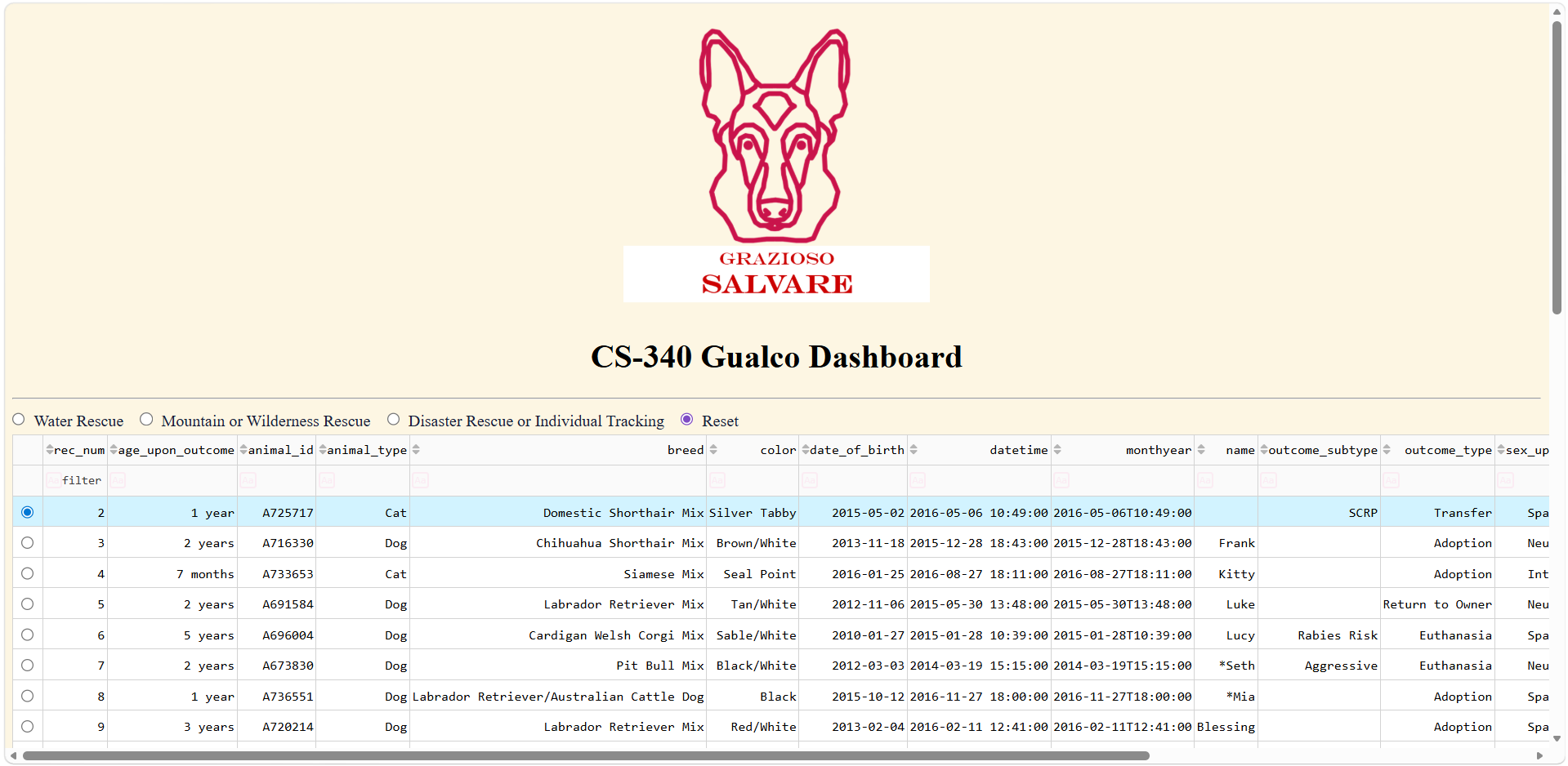 Figure 1 shows the new application with changes to CSS properties.
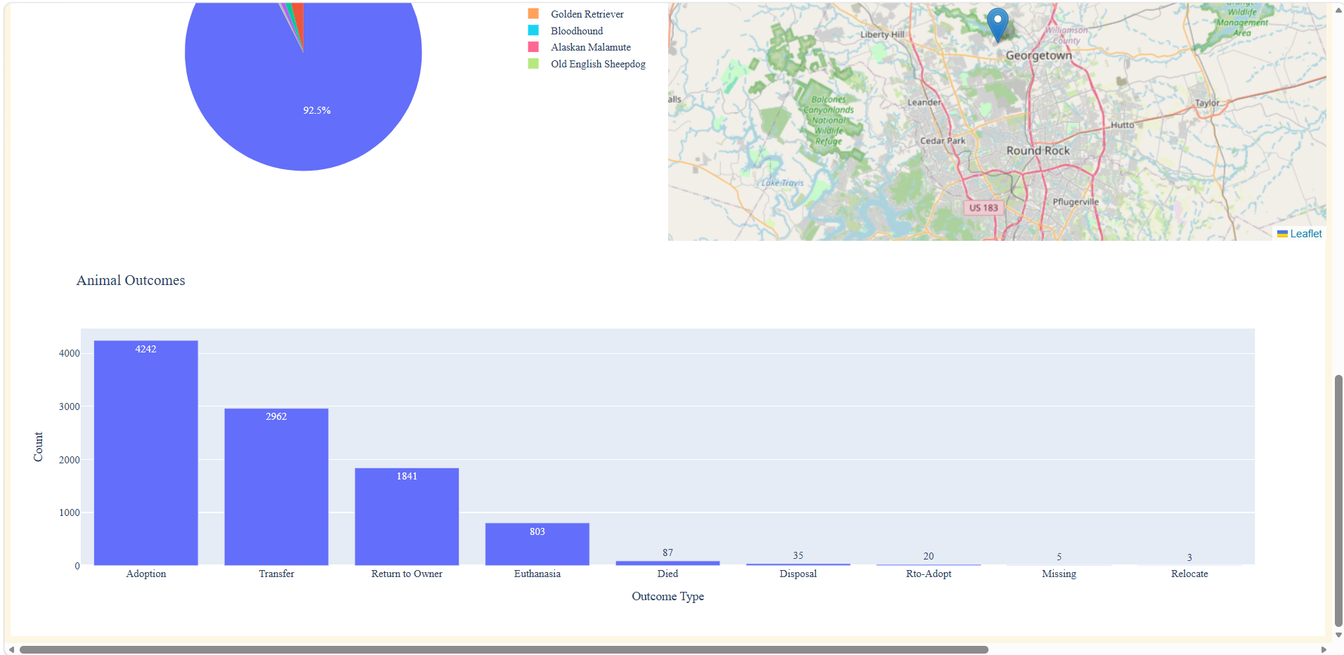 Figure 2 shows the new visualization (bar chart) that allows for insights into animal outcomes.